Basic Concepts
![]() The goal of Event Storming is to first gain an overview of the entire domain and then zoom into details to discuss opportunities and find bottlenecks. Colored sticky notes are used to describe business and information flows, user system interactions, and automated processes.
The goal of Event Storming is to first gain an overview of the entire domain and then zoom into details to discuss opportunities and find bottlenecks. Colored sticky notes are used to describe business and information flows, user system interactions, and automated processes.
Event Storming defines a limited set of elements. This simplicity is a key reason for its success. The entry barrier is low so that all people can use the method without long explanations.
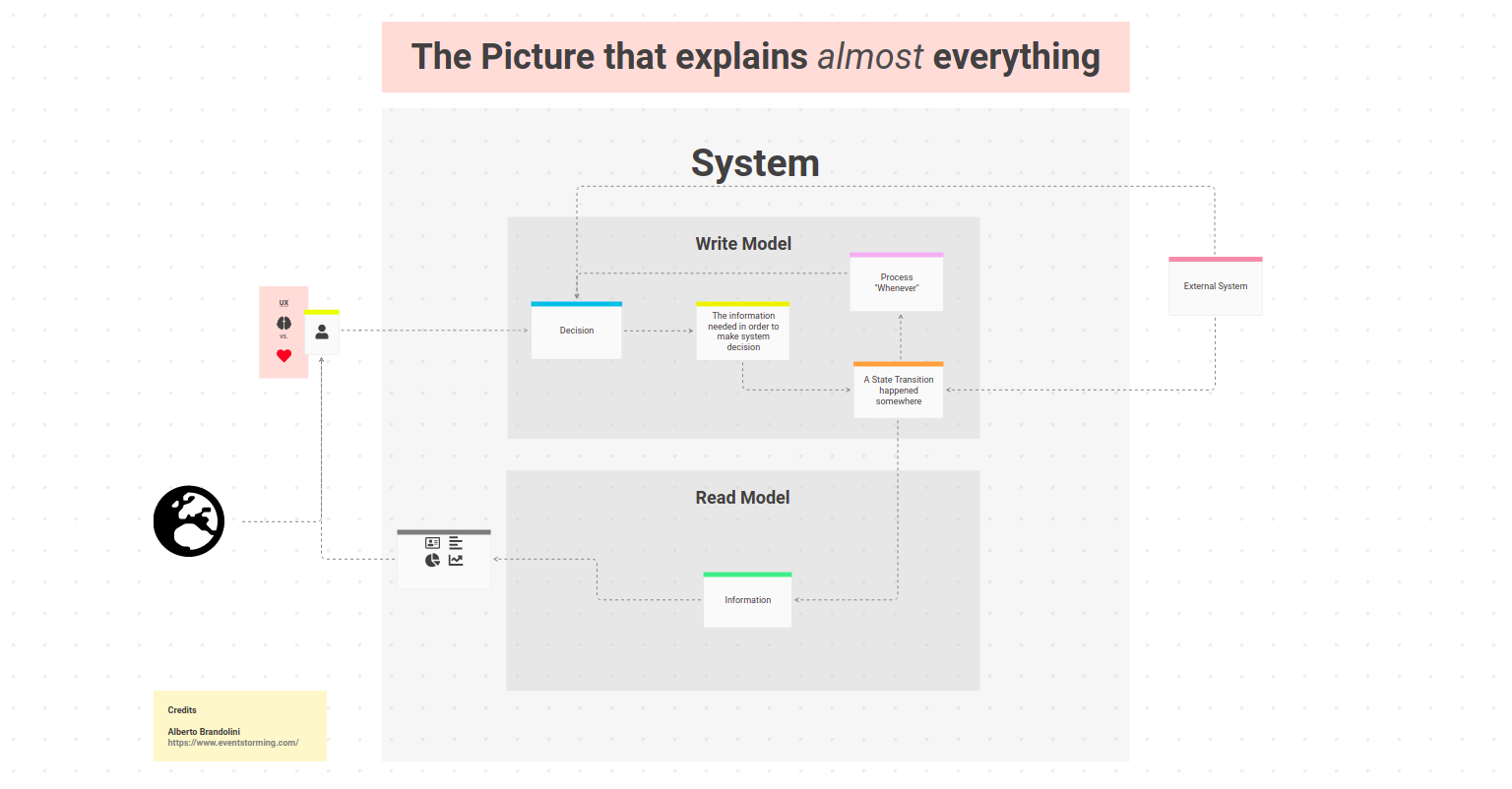
Open The Picture in the free client
prooph board’s primary modelling elements (called Cards) are based on Event Storming concepts. Instead of simple colored sticky notes, Cards have a type assigned. This enables rich model analysis and conversion to source code. We’ll cover that later in detail.
![]() Moderator Tip: First Event Storming Session? Introduce elements step by step. Start with Domain Events and explain further colors and concepts as needed. Try to avoid too much details in a Big Picture Event Storming. Getting an overview quickly is more important at the beginning.
Moderator Tip: First Event Storming Session? Introduce elements step by step. Start with Domain Events and explain further colors and concepts as needed. Try to avoid too much details in a Big Picture Event Storming. Getting an overview quickly is more important at the beginning.
Domain Event
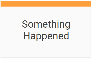 Probably the most important element in Event Storming is the Domain Event. It represents a fact — something that has happened.
The corresponding color is orange.
You can describe every activity, data flow or process as a series of Domain Events e.g. “User Browsed Online Shop” -> “Item Put Into Cart” -> “Order Placed” -> “Order Paid” -> “Order Shipped”.
It’s this simple concept that makes Event Storming successful. A quick explanation how to formulate an Event and the Big Picture Event Storming session can start.
Use past tense in Domain Events. Put them in chronological order from left to write to tell a story. Ask questiosn like: What other events need to happen before this event?, Who or what causes this event? When does the event happen? …
Command
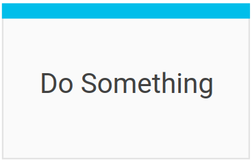 A command represents a decision that something should happen. The color code is blue
It can be a decision of a user e.g. who wants to Place an Order or Pay an Invoice as well as a decision based on a Policy or made in an External System.
Usually, commands are named with a verb in imperative mood, present tense - followed by subject e.g. “Start Engine”, “Buy House”, “Share Picture” …
Commands cause events. Often, you have a 1:1 relationship between them: Pay Order -> Order Paid, Book Room -> Room Booked. However, one command can cause one, multiple or no events. It depends on the business rules.
Actor
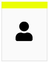 Actor cards are used to highlight that users with a certain role are involved in a business process
or use a specific UI to make decisions. The color code is lemon yellow and the card is in portrait.
Write the user role on the card and put it next to a UI or Command card.
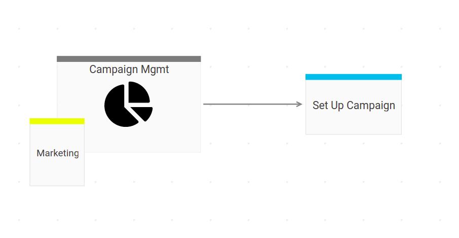
Aggregate
 The term aggregate is borrowed from Domain-Driven Design.
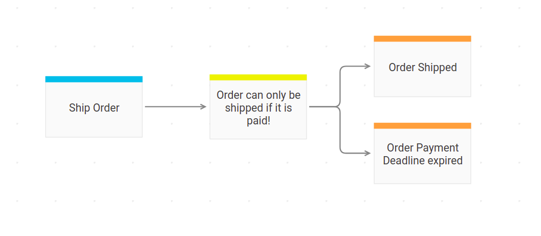
In Event Storming it’s basically a business rule that makes sure a Command can be executed e.g. An order can only be shipped if it is paid. Write down such rules on sunny yellow cards
and put them between a command and one ore more events.
Information
 Green cards represent information needed to make a decision.
Information are usually displayed in a UI, but can also be in an excel sheet, PDF document or printed out on paper. External Systems fetch information via API or from a database to make decisions.
All these cases can be visualized with green Information Cards in combination with others.
Every information change should be described as a Domain Event. If there was no event, the information did not change!
Developers familiar with the architecture pattern CQRS should also know the term “Read Model”. Both terms can be used interchangeably.
Policy
 A Policy is a reaction to an event. It represents automated decision and coordination logic.
Simply said: If this, then that!. Lilac Cards are used for policies. They trigger new commands.
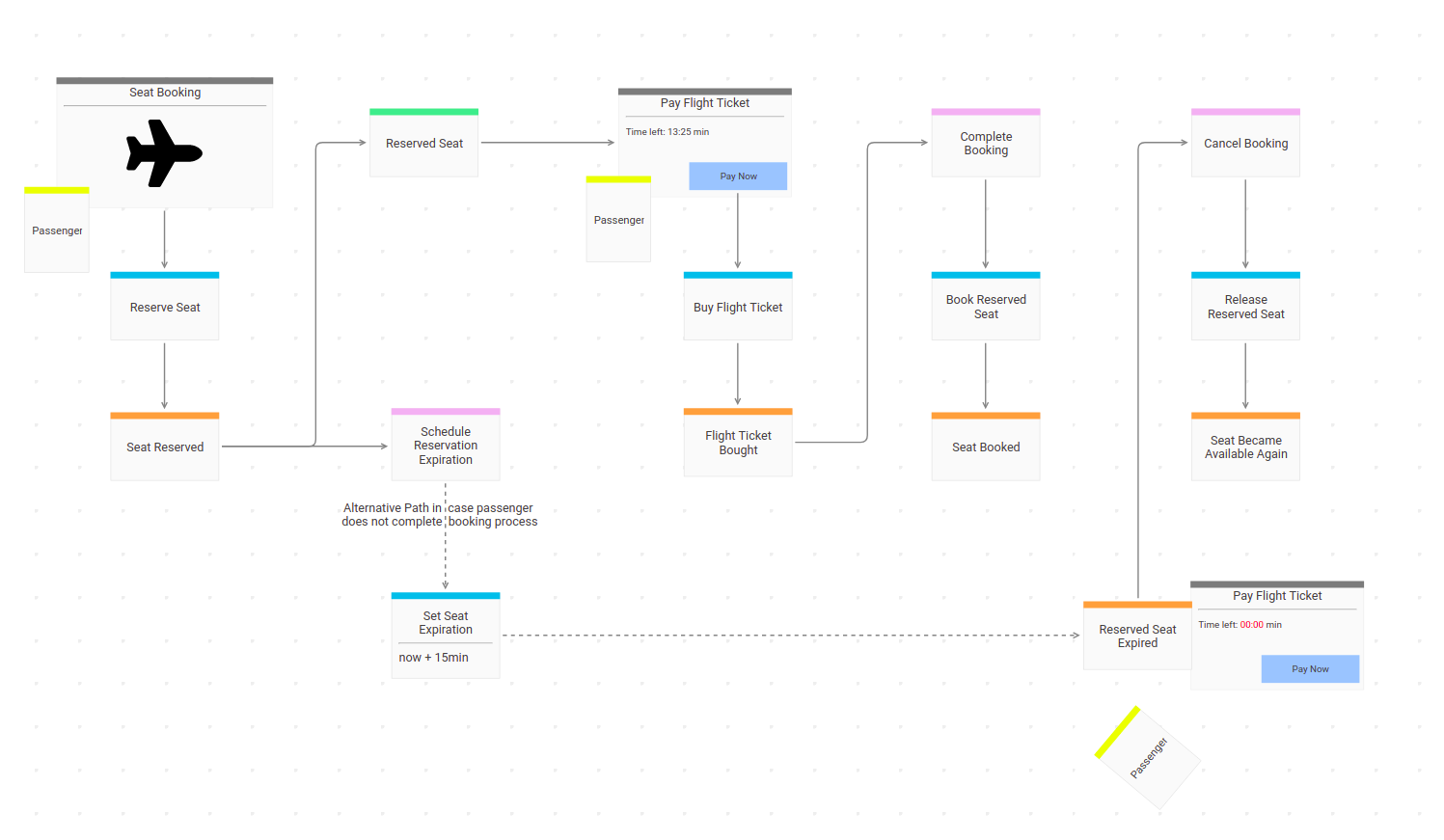
A good example of a process with policies involved is a reservation. Imagine a ticketing system of an airline. While booking a ticket, one can usually select a free seat in the airplane. A resulting event could be Seat Reserved. As soon as a Policy receives the final event Flight Ticket Bought, it can trigger a command to change the reserved seat into a booked seat. This should happen within a fixed timeframe, let’s say 15 minutes. If the potential passenger does not finish the booking process, the Policy will trigger a command to change the seat back to available.
Hot Spot
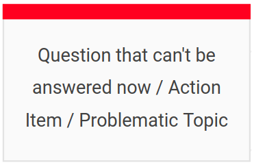 No Event Storming without Hot Spots. If you don’t have a couple of red Cards on the board after a Big Picture
Event Storming, you did not dig deep enough
 ![]() . Just kidding, but a Hot Spot is the swiss army knife for an Event Storming facilitator.
. Just kidding, but a Hot Spot is the swiss army knife for an Event Storming facilitator.
Use Hot Spots when:
A question came up that nobody can answer right now -> Write it on a Hot Spot and put it close to the elements on the board that triggered the question.
A discussion between two experts becomes heated or drifts into details so that no one else can follow anymore -> Stop the discussion, write the topic on a hot spot with a note that it should be revisited in a follow up.
Someone points out a pain point in a process or describes something as a bottleneck -> Write it down and mark the area on the board with the Hot Spot.
![]() Hot Spots are good action items to tackle after an Event Storming session.
Hot Spots are good action items to tackle after an Event Storming session.
External System
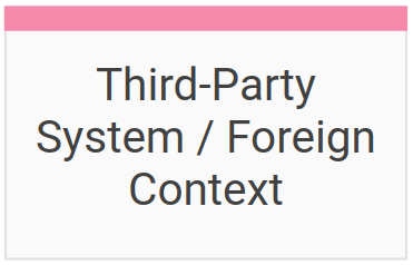 A third-party system involved in a business process can be visualized with a dusky pink Card.
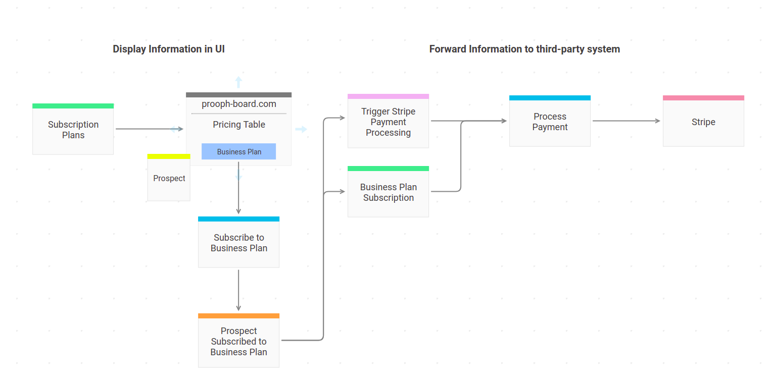
Digitizing workflows often means connecting and orchestrating different digital services. Event Storming is a lightweight method to plan and document interactions between your system and external services.
UI / API
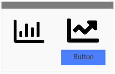 The original color code for UI stickies is white, but on prooph board all cards are white with a colored top bar.
So we decided to invert the color and use black for UI Cards. We also extended its meaning to include APIs. APIs as well as UIs are public interfaces.
One for humans the other one for machines. To keep the color code simple, black Cards combine both - human and machine interfaces - to a unified Interface Card Type.
Use icons on UI Cards to roughly sketch what is visible on the screen. Just enough to support the idea. Don’t waste your time with too much details. prooph board is not a wireframe tool. UX / UI designers have their specialised tools for this task. However, screenshots of wireframes / existing UIs are a quick and easy way to include more detailed designs in Event Storming sessions.
